The Vivid Light Show projection on to The Sydney Opera House and the giant chandelier in front of the Park Hyatt was again a real draw card on my 2nd visit. The chandelier had changed colour from magenta (the night before) to a warm red. I experimented with the camera settings including the white balance to see how it could help me capture the vivid colours I could see. In this post I will share what I did to capture the images below.
 Camera settings: 1/30 sec at f / 4.0, ISO 3200, Focal length 100mm, Lens Canon EF 24-105mm IS USM, Camera 5DMarkII using live view to focus (for explanation on live view see previous post about VIVID here). Because I was using live view to focus very accurately the quality of the image file was still very good. I would not normally rely on such a high ISO as I would want to keep the grain structure of the images as defined as possible. With the shutter speed of 1/30 sec it doesn’t show any real obvious suggestion of movement in any areas of the image. There is a ferry on the left side which looks like it is static, when in actual fact it was doing a 180 degree turn. In the image below you will see I have slowed my shutter speed down to give more of a hint of a moving vessel passing through the setting.
 Camera settings: 1 sec at f / 8.0, ISO 800, Focal length 105mm, Lens Canon EF 24-105mm IS USM, Camera 5DMarkII using live view to focus.
As it was quite tricky to capture the true colour of the foreground lights cluster to be as vibrant as I was seeing, I experimented by setting the white balance to Tungsten. This tungsten setting is normally used when you are photographing in a situation where tungsten lights are making your image very warm yellow and you don’t actually want this warmth to be captured, instead wanting a more neutral colour balance in your image. What this did was alter the colour balance of some objects in the image by adding a blue cast. This gave me a close rendition to the actual colour I saw from the round globes in the foreground. This colour cast also affected the Opera House colour which I was very happy about. Last year the Opera House was so vibrantly coloured compared to this year, so I was pleased to see this colour shift. I would normally not try to change the colour but this time I think it worked well. In both images I also waited until ferries or boats came through to add a bit of extra light and ghosting through the image. By choosing f /8.0 for my aperture this time I was then able to slow the shutter speed down to 1 sec and this allowed me to capture the impression of movement from a passing cruise boat.
I processed these images in lightroom and using a simple filter plug in program (accessed via lightroom) called Color Effex Pro I used ‘tonal contrast’ to ensures the vibrancy of what I saw is produced in the final image output! If you want to try this program visit Nik Sofware for a free 30 day trial. It takes less than one minute to open the image though lightroom (or photoshop if you are working with a jpeg/tiff/psd) and choose the best filter for your image and then it creates a copy of your original image with the filter adjustments. You then output your images to jpegs/tiffs/DNG.
Next time I will post some of my images from last year’s Vivid and show you the elevated view from the Overseas Passenger terminal. The view was uninterrupted, and the projections were much more colourful, but my main tip here is to try to have layers of depth and include points of interest in the foreground and throughout your image composition.
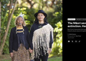
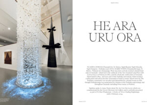
NATIONAL GEOGRAPHIC INDIGENOUS FUTURES JULY 2024 ISSUE FEATURING STORY BY AROHA AWARAU AND IMAGERY BY TANIA NIWA
A special National Geographic Indigenous Futures Issue came out in the USA July 2024. https://www.nationalgeographic.com/culture/article/maori-language-nest-model-new-zealand The story I was engaged to capture imagery for was